Call to Action - What Is It and Why Your Site Needs One

What is a Call to Action?
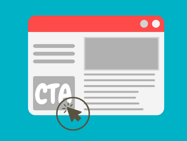
In general marketing terms, a call to action—or “CTA”—is a statement designed to prompt an immediate response from the person reading it.
In terms of your website, a CTA is a short chunk of text telling the site visitor to take some sort of action. The CTA can be just a few words but is often one complete sentence; two sentences at most. It contains an action phrase or command like, “Buy Now!” or “Click to Learn More” along with a link or button to click.

Why Should I Care About a CTA on My Website?
Your local business website should be a sales funnel. You attract potential customers to your website, you provide them with a great experience while on your site, and... then what? Well then you work to convert them into a lead and hopefully, a customer. You do this with a strong call to action.
Want your site visitor to schedule an appointment with you? Tell them. Use your CTA to invite the site visitor to fill out a contact form and book an appointment.

Aiming to get the site visitor to buy something right away? Make it easy for them with a clear call to action.

Common Misconceptions About CTA’s
Here at Locallogy, our custom website clients often ask us about two fairly common misconceptions related to CTA’s.
Misconception #1
My site visitors already know what action to take, I don’t need to tell them.
Actually, no, they probably don’t. And even if they did, do you want your site visitor to spend even half a second trying to find the “Contact Us” page on your site? Of course not, because precious seconds can be the difference between clicking a button on your site to clicking away to another site altogether.
Instead of assuming, or hoping, that your site visitor knows the next step to take in the sales process, make it easy for them. Include a straightforward and simple to use call to action on each page of your site. Make it clear what needs to happen next - “Click Here for Your Discount” or “Click to Make Your Reservation!”
Misconception #2
CTA’s are annoying and my site visitors will be irritated.
If you’re doing it right, this shouldn’t be the case at all. A well-planned CTA shouldn’t be intrusive or annoying. It should fit in and flow along with the rest of the webpage it’s on, standing out enough to attract the viewer’s attention but not so much as to be obnoxious.
Excessive pop-ups, auto-play audio, elements that cause the website to load slowly – those are aspects of a website that annoy visitors and make it less likely they’ll stick around.
Are CTA’s Just for My Homepage?
CTA’s are not exclusive to your homepage. In fact, every single page of your site should contain a CTA. You may have the same CTA throughout your site or you may opt for different CTA’s depending on the particular page. But the important thing is to include one on every single page.
In many cases, a nice, clear CTA is right there in the footer of a website so it follows the site viewer no matter which page they visit.
Help Your Customer Make the Right Decision
Remember, you can’t assume your site visitors know what steps to take or that they’ll spend any time trying to figure it out. Make it clear to your potential customers—give them a no-brainer option that’s as easy as the click of a button.
Get the Latest Content in Your Inbox
Want to be the first to know about new content? Sign up to get our weekly blog posts sent to your email!