Infographics: How to Turn Boring Text into Engaging Visuals
3 types of infographics and where to use them
As digital marketers, we’re always looking for ways to spice up our content. When scanning countless articles to find the information you’re looking for, a page full of text with nothing to break it up can be a huge turn-off. And while adding images to a post is a no-brainer, we like to look for other ways to portray an article’s key details through visuals. One of our favorite ways to do this is through infographics.
What is an Infographic?
Many of you are probably familiar with what an infographic is—you all have our permission to skip ahead. But for those who haven’t heard of this term before, you’re not alone. First, let’s break down the word itself: info-graphic. Information-graphic. An infographic is nothing more than a visual representation of information.

In addition to breaking up text on a page, infographics can boost your content in other ways, too:
- Keeping visitors on your page
- Providing sharable content
- Visualizing data in new ways
- Making number-heavy content more digestible
- Adding creativity to your text
If you’re ever struggling to accurately get your point across via text, try putting it into an infographic instead.
Different Types of Infographics
Infographics can come in a variety of formats. What you choose to use will primarily depend on the type of information you’re looking to display. In this blog post, we’re detailing our top three most-used types of infographics and when to use them.
Lists
List-based infographics are the easiest and quickest way to create a visual out of information. It’s one we use quite frequently.
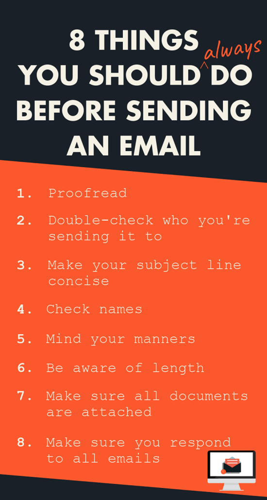
The above infographic is from a blog post on email etiquette. The original blog post received more social engagement, clicks and shares than any other blog post. Why? Because of this infographic.
Although it’s quite simple in format, it turns a boring list into something colorful and bold. Plus, the content is highly relatable for a wide audience range, making it perfect to share with colleagues or save as a friendly reminder.
Data
One of the most popular ways to convey a bunch of data is by turning it into an infographic. The reason so many writers, marketers and designers prefer this method is because it makes it so much easier to visualize what these numbers mean.
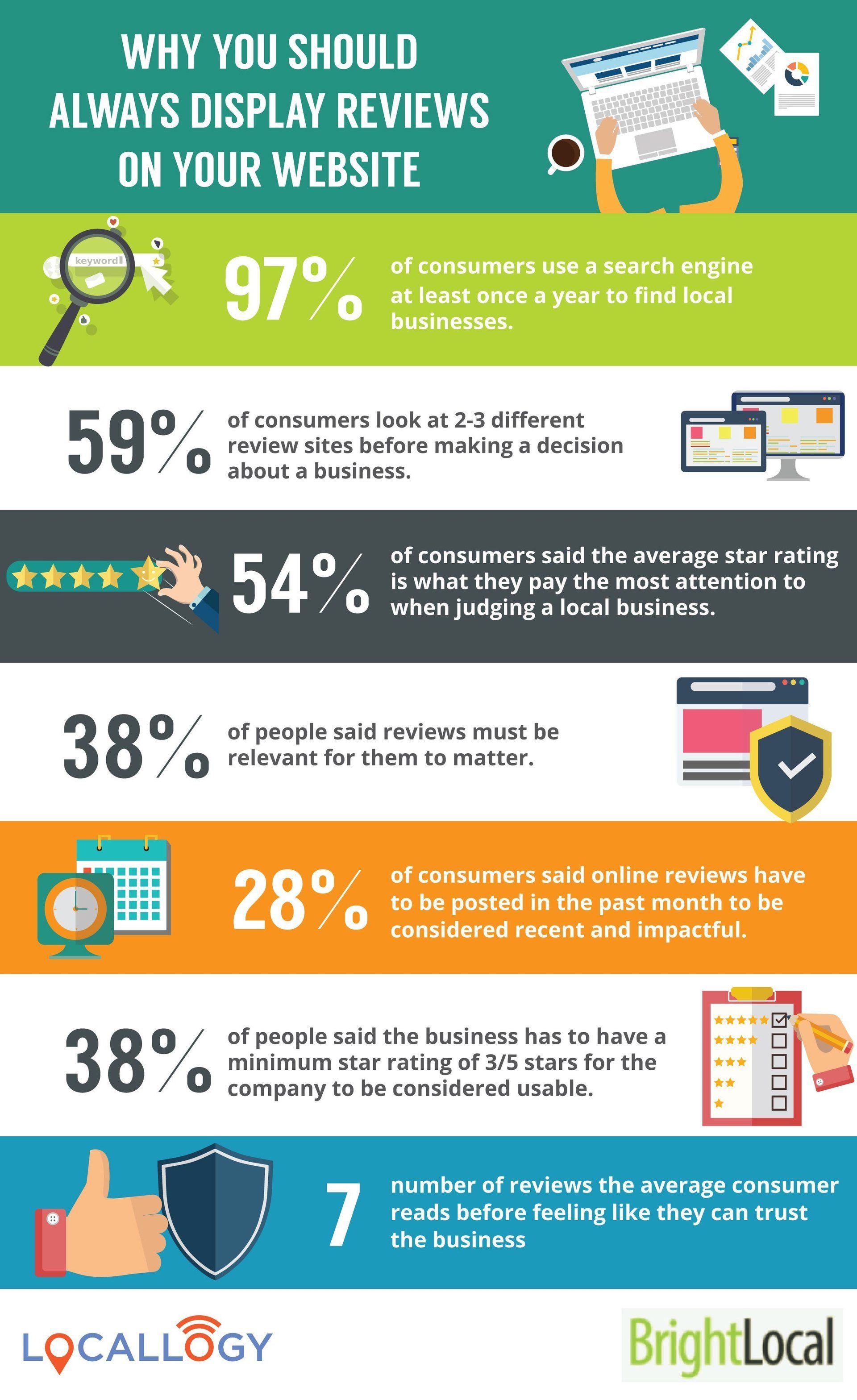
Take this infographic, for example. We created it to supplement a blog post that had numerous data points within the content. Reading all these numbers in a paragraph is enough to make your head spin, which can easily turn readers away if they’re looking for scannable information.
Putting those numbers into a format like this not only gets the message across, but also makes it more memorable compared to other content.
Quizzes
Quiz infographics are a little more complicated to create, but are a fun way to break up your content. Plus, they’re more likely to keep your audience on your page longer.
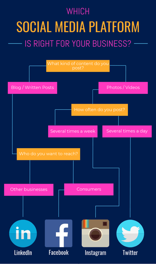
For this particular infographic, we decided to create a quiz that helps business owners figure out which social media platform worked best for their business. Even though we only posed a few simple questions, this format was an engaging way to add to a post where we further broke down each of those results.
Seeing is Believing
Infographics are one of our favorite tools to utilize in blog posts , email newsletters and on social media. We’ve seen a lot of success in our content that includes this type of visual. Depending on your level of design expertise, infographics are pretty easy to create on your own—although, you can always hire someone to do it for you.
Do yourself and your content a favor and boost your audience engagement by translating your content into an eye-catching infographic.
Get the Latest Content in Your Inbox
Want to be the first to know about new content? Sign up to get our weekly blog posts sent to your email!