

How Important is Mobile First Web Design?
Google Validates Locallogy's Mobile First Approach
Today, more and more people are doing online research for services on their mobile devices rather than desktop or laptop computers. In fact, there’s a good chance you’re viewing this page on a mobile device or tablet right now. Because of this technological shift, we at Locallogy approach our clients’ website design with a mobile-friendly layout in mind from the start. But we aren’t the only ones embracing the mobile first web design.
In order to fully understand the importance of a mobile-compatible website, let’s start with the basics.
What exactly is mobile first web design?
Mobile first web design is the strategic design of a company’s website to be mobile-friendly, first and foremost, and then designing a secondary typical desktop layout. You have probably noticed that when you visit a website on your phone or tablet, it has a much different appearance than when you view the exact same page on your computer. That is because the website has been designed to respond to various viewing devices and change layouts accordingly.
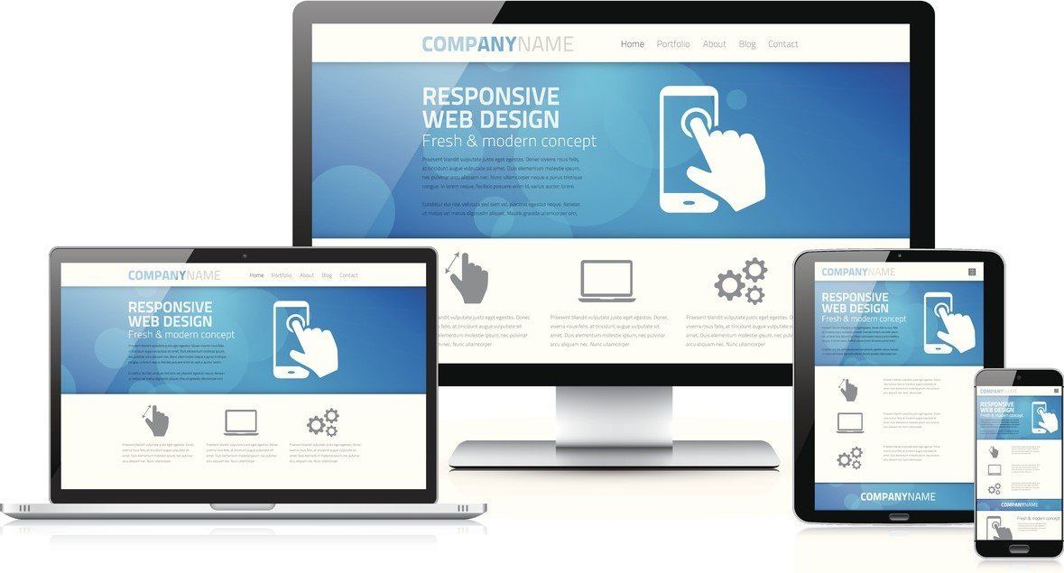
In a mobile first design, the website’s mobile page layout is designed on its own, rather than just being a smaller version of the desktop’s layout. This is crucial to both your website and marketing strategy in several ways:
- It makes your website more user-friendly
- It keeps people on your page longer
- It helps you rank higher on search engine results
These three key concepts are important to understand if you want your online marketing to be successful. Even Google has validated the importance of the mobile first approach to web design. Let us explain.
It Makes your Website More User-Friendly
Have you ever searched for something on your phone, clicked on a website and saw a page that looked identical to a page you would see on a full-sized computer but with microscopic text? You probably have at some point, and you probably left the site immediately.
Web pages that require zooming and scrolling to read a simple line of text are awkward and inconvenient. By designing your website for mobile compatibility first, you are making your site easy to use across all devices. Having an adaptable interface shows that your business is up-to-date and that you value your customers’ time and effort, making the process of working together as easy as possible.
Which leads us to the next point…
It Keeps People on your Page Longer
It’s simple: if people are able to navigate your page easily, no matter what form of technology they are on, they are more likely to stay on your website longer. If your website isn’t designed for viewing on various devices, you are missing a significant percentage of your target market. You are essentially driving people away from your services by not being user-friendly.
Take our client Chi Solutions , for example. Their website—including mobile, tablet and desktop versions—was designed with the mobile-friendly layout in mind first. As you can see below, the mobile layout is very different from the desktop layout, even though it displays the same information.
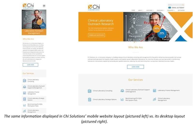
The difference mirrors Chi Solutions’ professional and up-to-date services, and allows users to navigate through various pages with ease. This keeps visitors on the website longer, since they feel comfortable with usability. Because they adapted a mobile first website design, visitors are able to access their site on all technological platforms, making Chi Solutions an easy choice over their competitors.
It Helps You Rank Higher on Search Engine Results
Visitors aren’t the only ones who recognize mobile-friendly web design. Google is able to identify websites that are compatible with mobile devices and actually factors it in when displaying local search engine results on mobile technology. If your business has a mobile first web design, Google will rank you higher on a mobile search than similar companies that are not designed for this compatibility.
Why is it important?
In terms of mobile first web design, here’s what it comes down to: people want to work with a service they feel confident will do the hard work for them. Since your website is an extension of your business, it reflects your quality of service, right down to its usability. If people have a hard time navigating your website on their mobile devices (common technology nowadays), they will assume your services are the same—difficult to work with, lacking in fundamental technology and overall unsatisfactory.
Adopting a mobile first web design might seem like a daunting task, but with the way people are changing how they use the Internet, you really can’t afford not to embrace it.
Get the Latest Content in Your Inbox
Want to be the first to know about new content? Sign up to get our weekly blog posts sent to your email!


